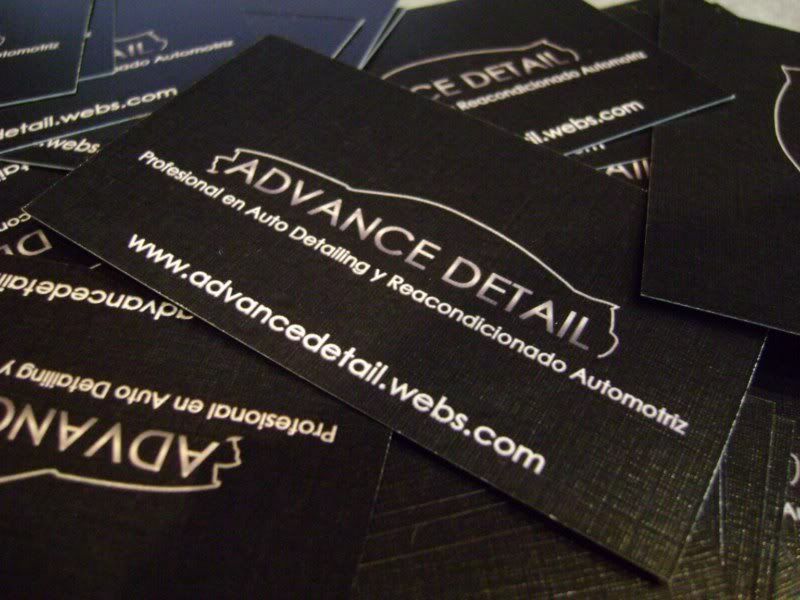
• If this is your first visit, be sure to check out the FAQ by clicking the link above. You may have to register before you can post: click the register link above to proceed. To start viewing messages, select the forum that you want to visit from the selection below.

Announcement

Collapse
No announcement yet.

Business Cards?

Collapse
X
 
  • Filter
  • Time
  • Show
Clear All
new posts

  • #46
    Re: Business Cards?

    I like the simpler fonts. They tend to look better and are easier to read especially if you making reproducing something with the logo or resizing it.

    Remember - if a customer can't read the text, they don't know who you are or what you do.

    Comment


    • #47
      Re: Business Cards?

      Originally posted by CumminsCrazed View Post
      i know and i still like #3

      I do too, but not with the mixed fonts. It looks very 'off' to me with those two fonts. My logo has 2 different fonts, but they compliment each other.


      Colin
      A common mistake that people make when trying to design something completely foolproof is to underestimate the ingenuity of complete fools.

      Comment


      • #48
        Re: Business Cards?

        ok colin, tell me your thoughts on this one!!

        Zach Hall

        2001.5 Dodge Ram 2500 Cummins Diesel - DD/Tow rig
        1983 Chevy C10 - Race/Show rig
        1939 Dodge D11 Luxury Liner Deluxe - Antique resto. project

        Comment


        • #49
          Re: Business Cards?

          that looks nice Zach, i had a friend design mine, i told him what i wanted... a car outline and my company name underneath, not very complex but i like the outcome,


          i will probably have someone professionaly redesign my logo, but for now i have been real happy with it.
          Nelson Zapata - Advance Detail - Detailing and Auto Reconditioning in Santiago Chile.

          Comment


          • #50
            Re: Business Cards?

            I like the curve of the bottom words. As far as everything else, I think your original concept was better. The big chunky font really hides the silhouette of the truck. In the original, I like the way "Hall's" isn't overlapping, or layered, on top of the truck. Just my opinion. Go with what you like, though.

            Colin
            A common mistake that people make when trying to design something completely foolproof is to underestimate the ingenuity of complete fools.

            Comment


            • #51
              Re: Business Cards?

              ok, heres another update, back to original text with the curved bottom

              Zach Hall

              2001.5 Dodge Ram 2500 Cummins Diesel - DD/Tow rig
              1983 Chevy C10 - Race/Show rig
              1939 Dodge D11 Luxury Liner Deluxe - Antique resto. project

              Comment


              • #52
                Re: Business Cards?

                Zach, why did you change from "Custom Detailing" to "Auto Detailing"? Just curious.

                Colin
                A common mistake that people make when trying to design something completely foolproof is to underestimate the ingenuity of complete fools.

                Comment


                • #53
                  Re: Business Cards?

                  i didnt, i think it was a mishap in the designer LOL!
                  Zach Hall

                  2001.5 Dodge Ram 2500 Cummins Diesel - DD/Tow rig
                  1983 Chevy C10 - Race/Show rig
                  1939 Dodge D11 Luxury Liner Deluxe - Antique resto. project

                  Comment

                  Your Privacy Choices
                  Working...
                  X